
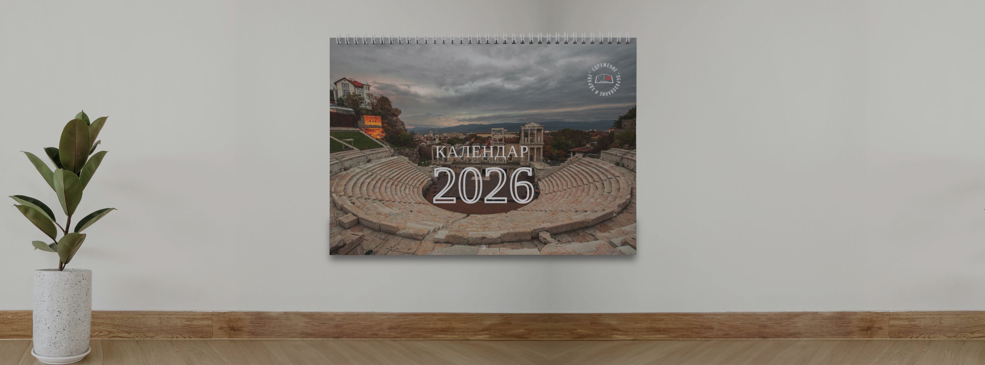
Designing a Calendar
that gives back

Category
Brand Architecture
UI/UX & Visual Design
Client
Non-profit Association "Education and Health"
Start Date
2025
Non-profit Association "Education and Health"

Calendar with a Cause

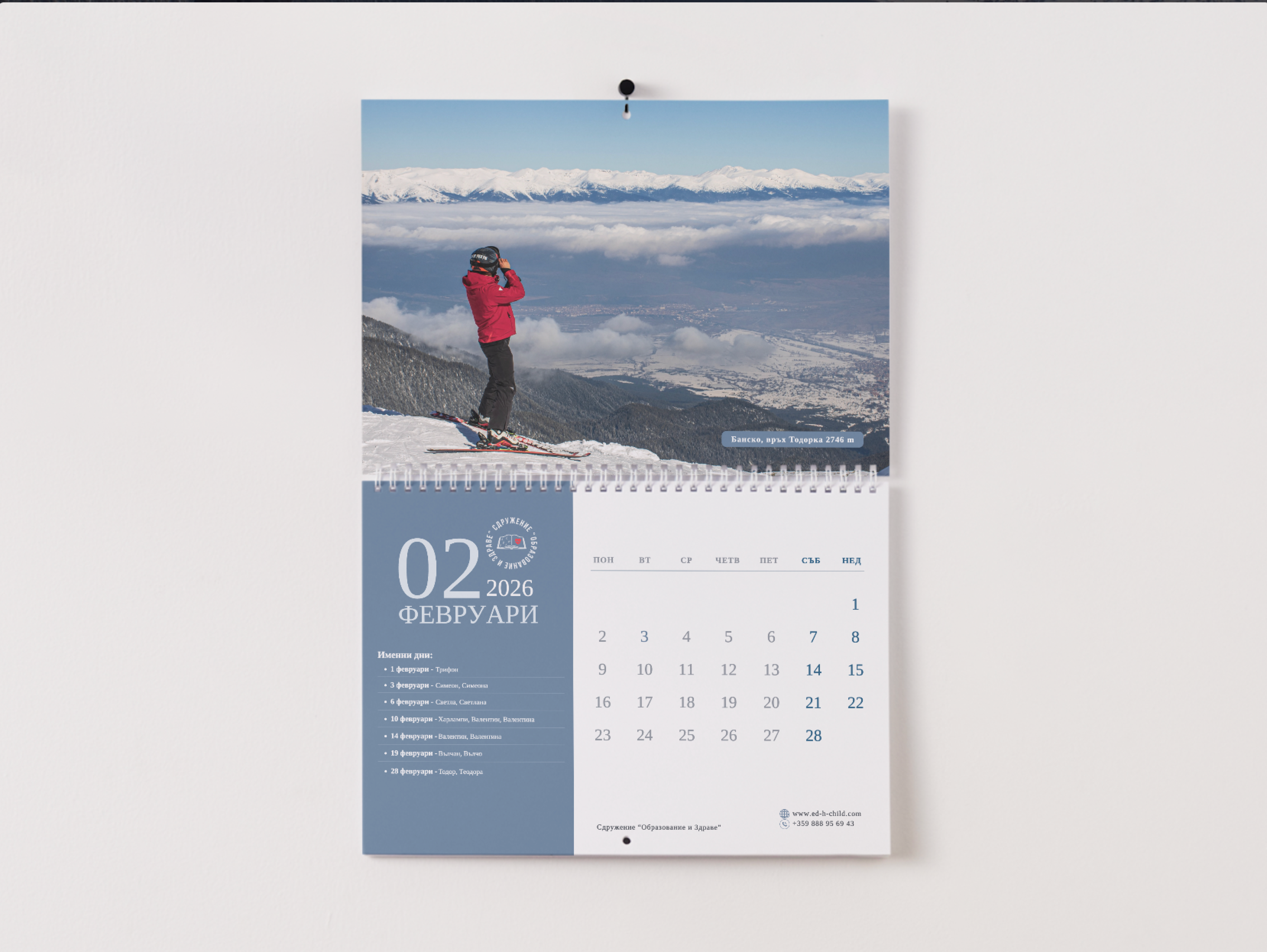
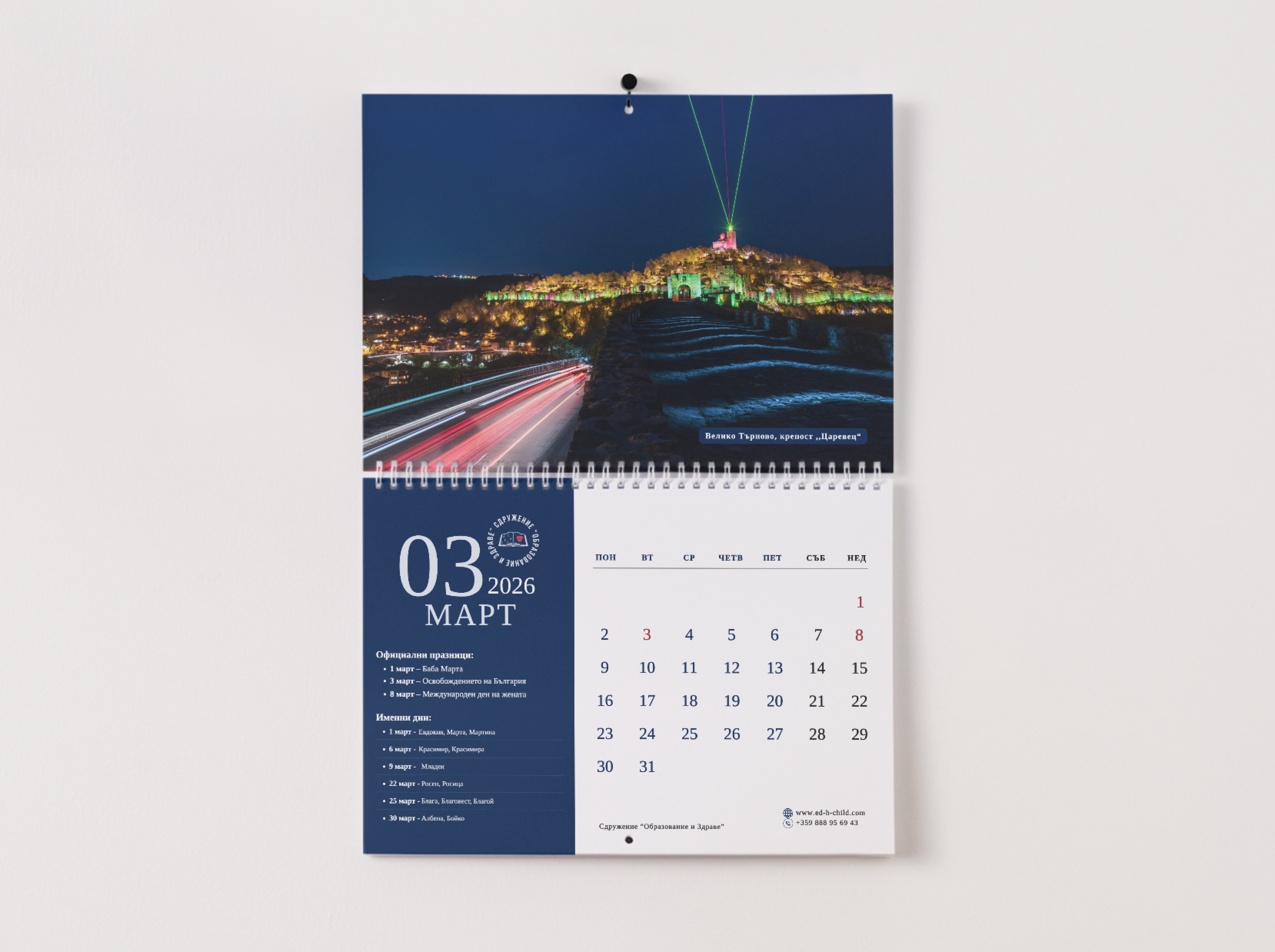
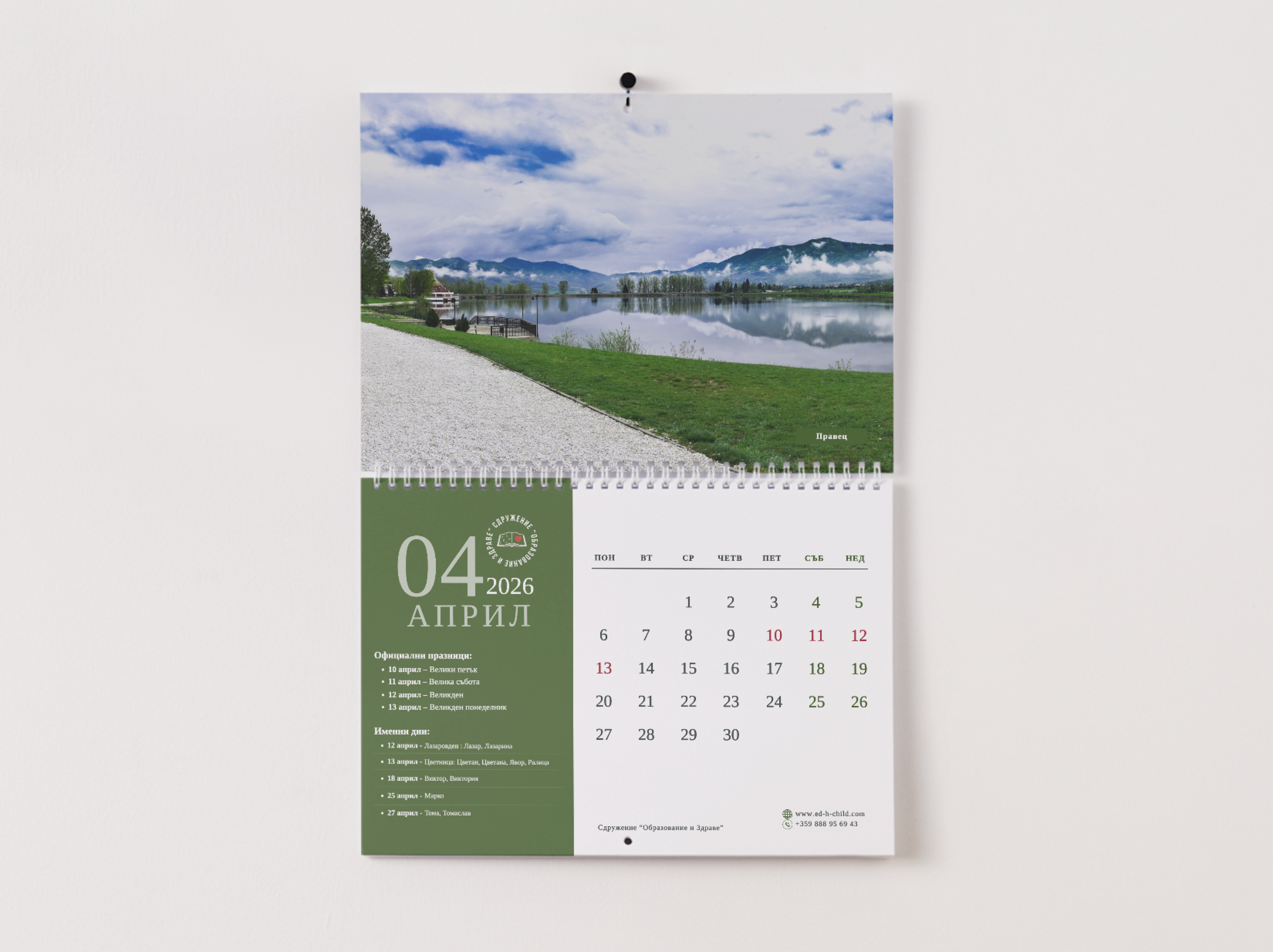
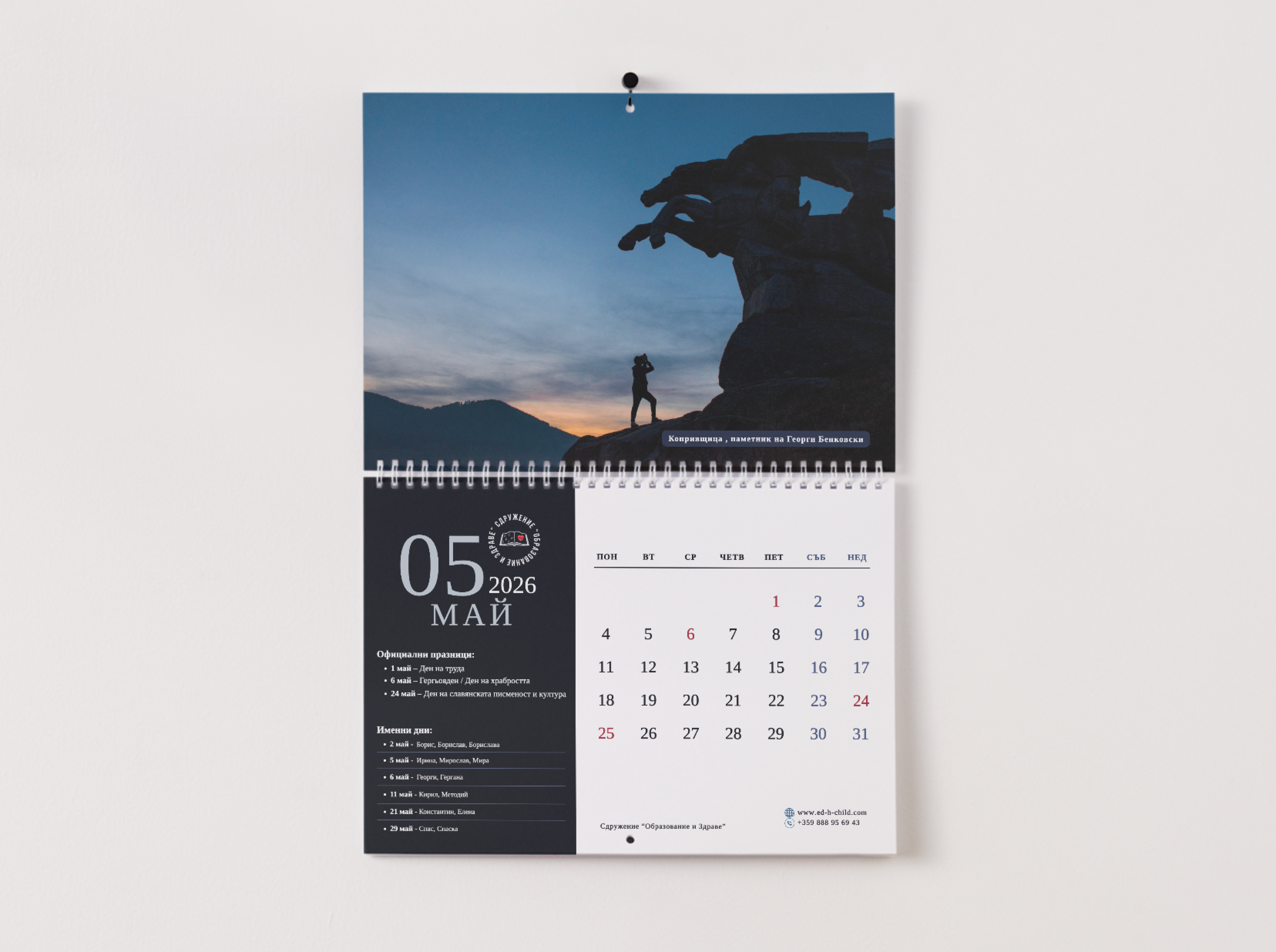
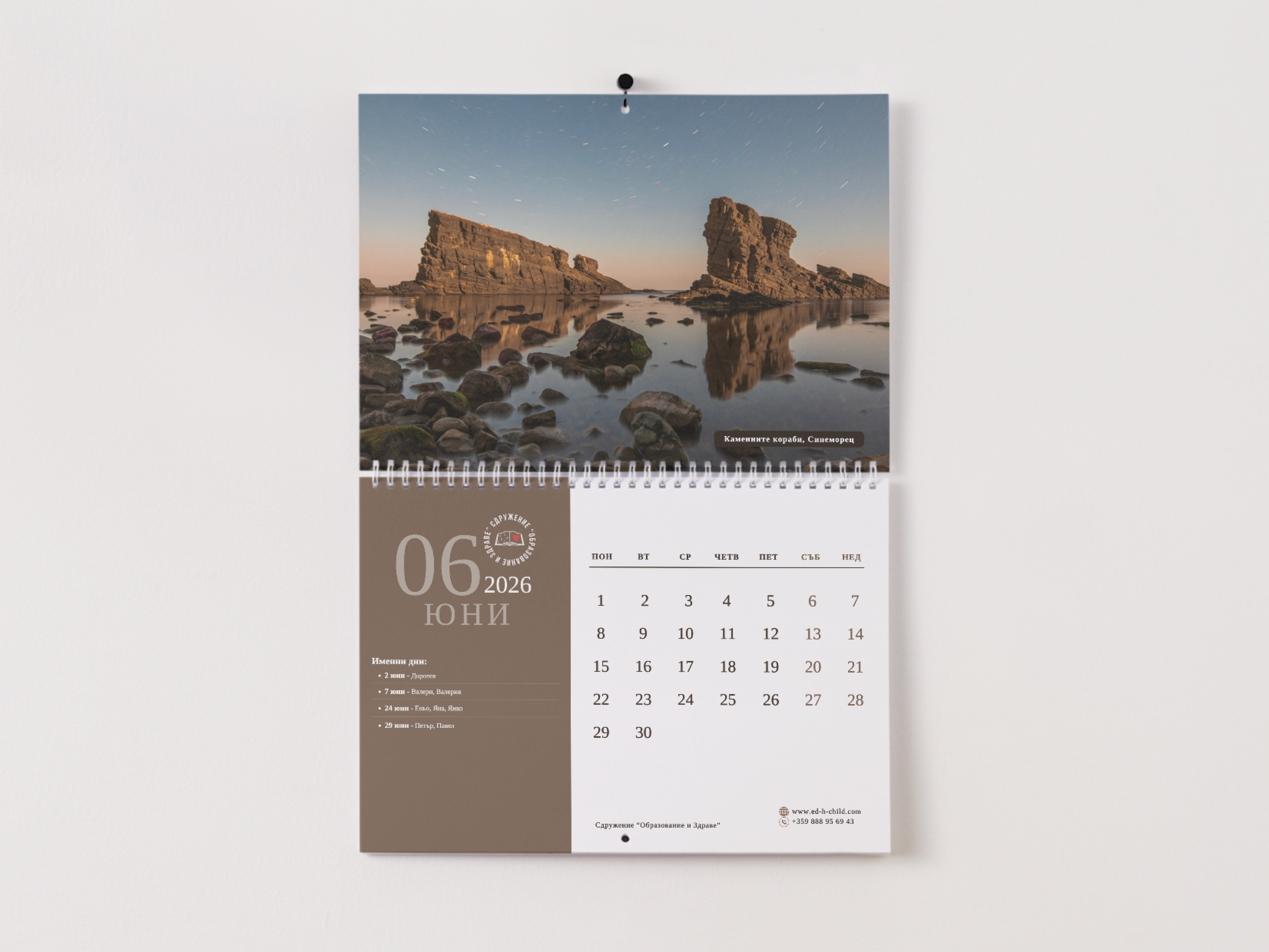
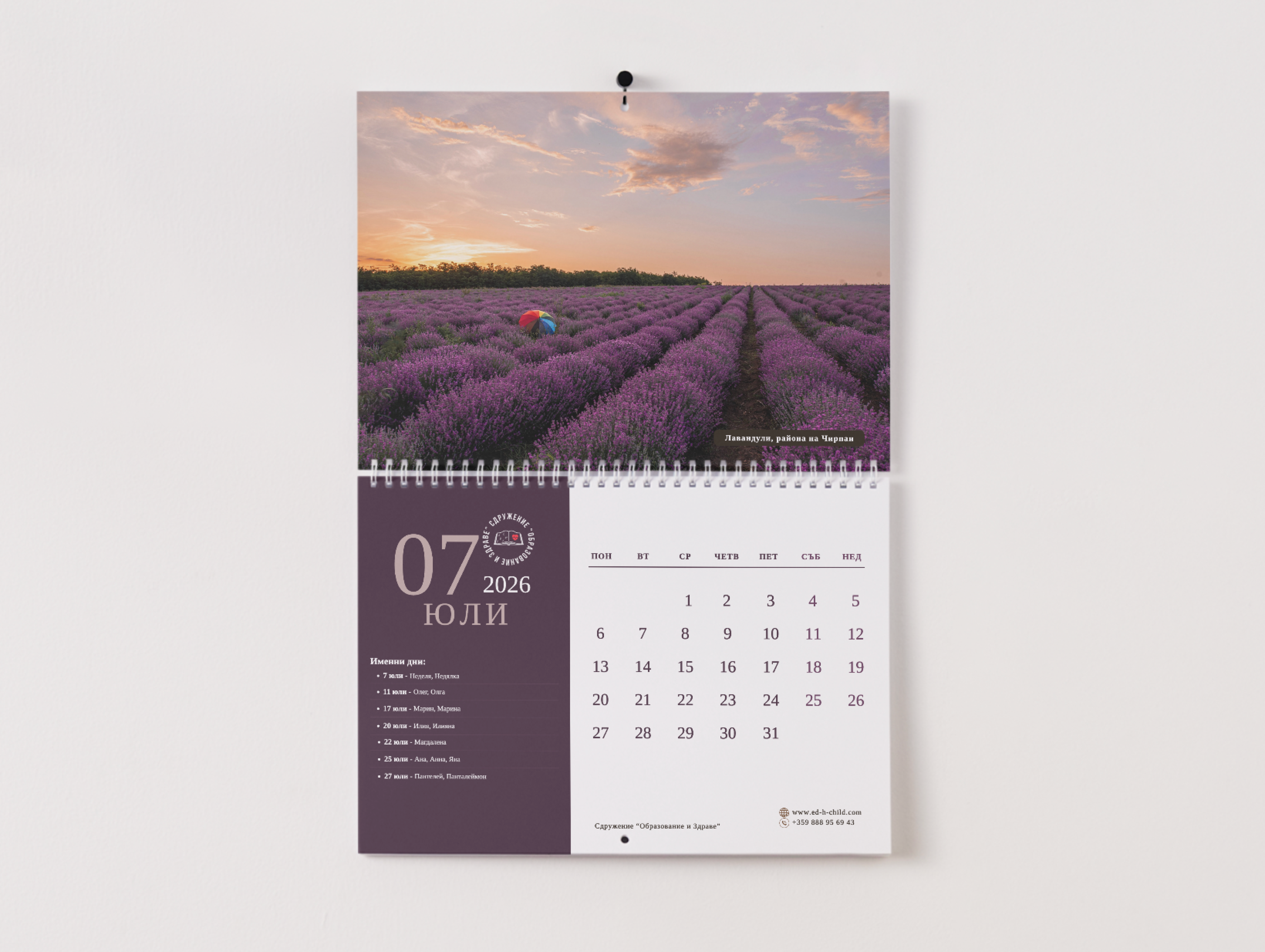
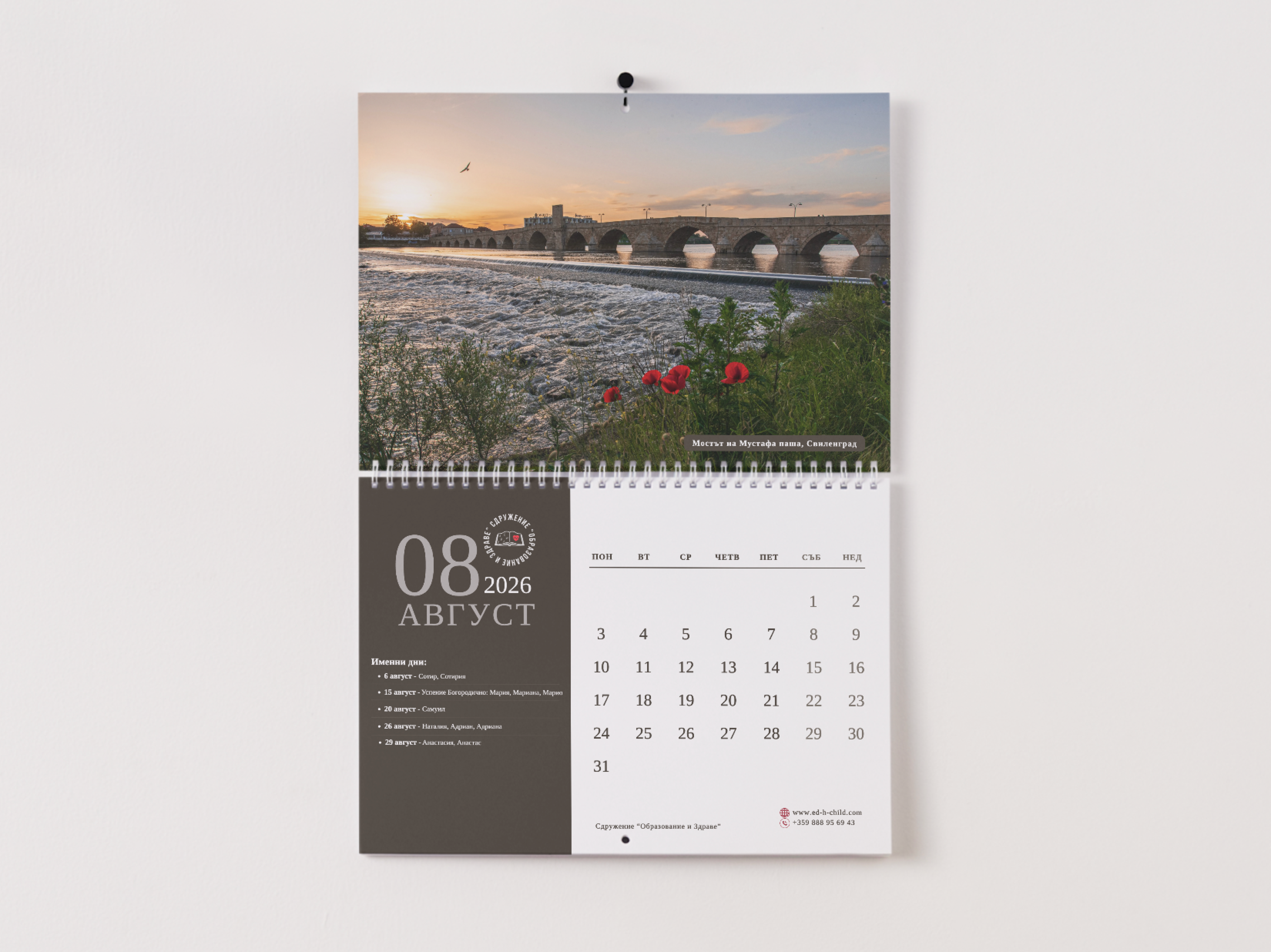
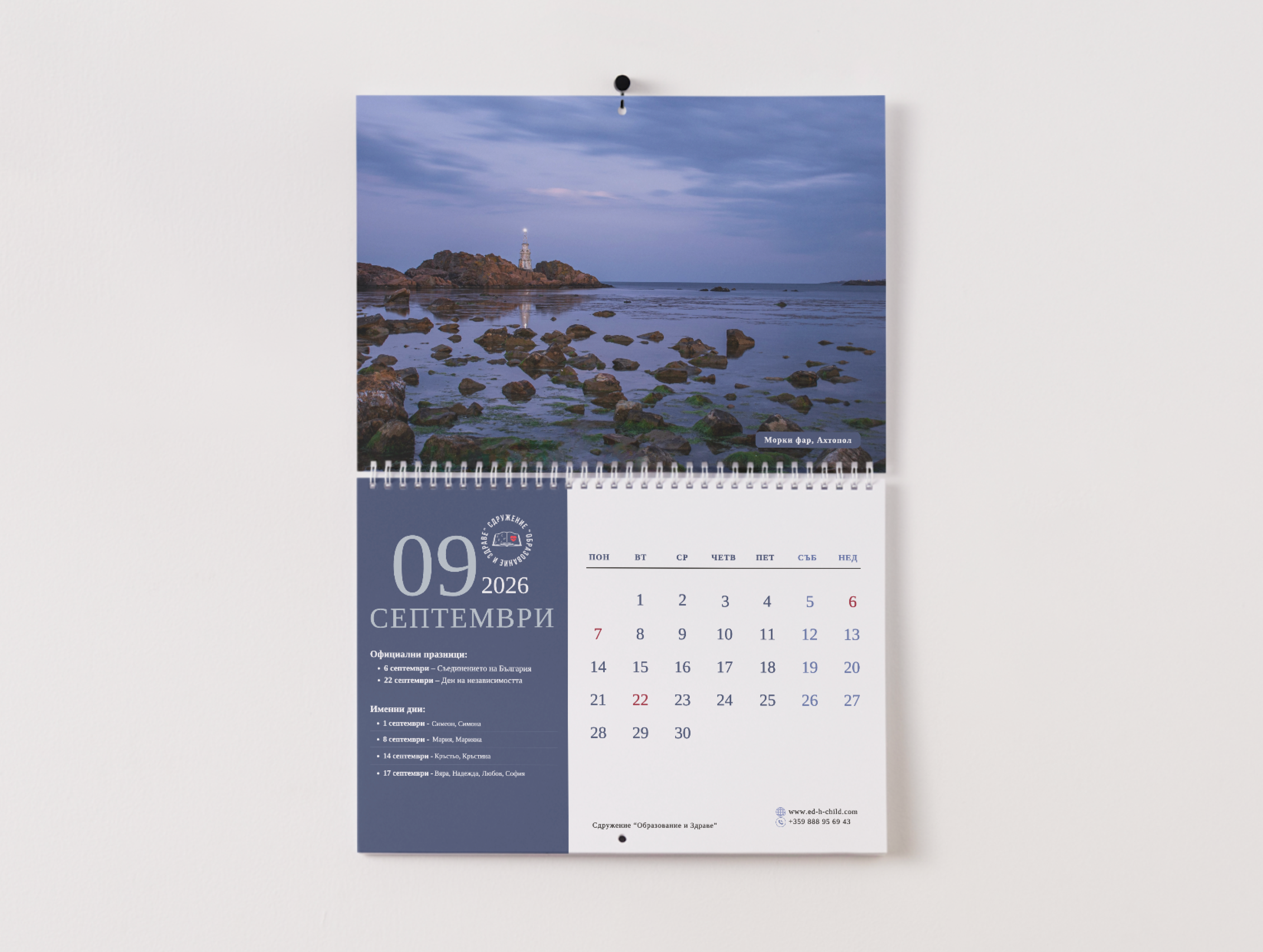
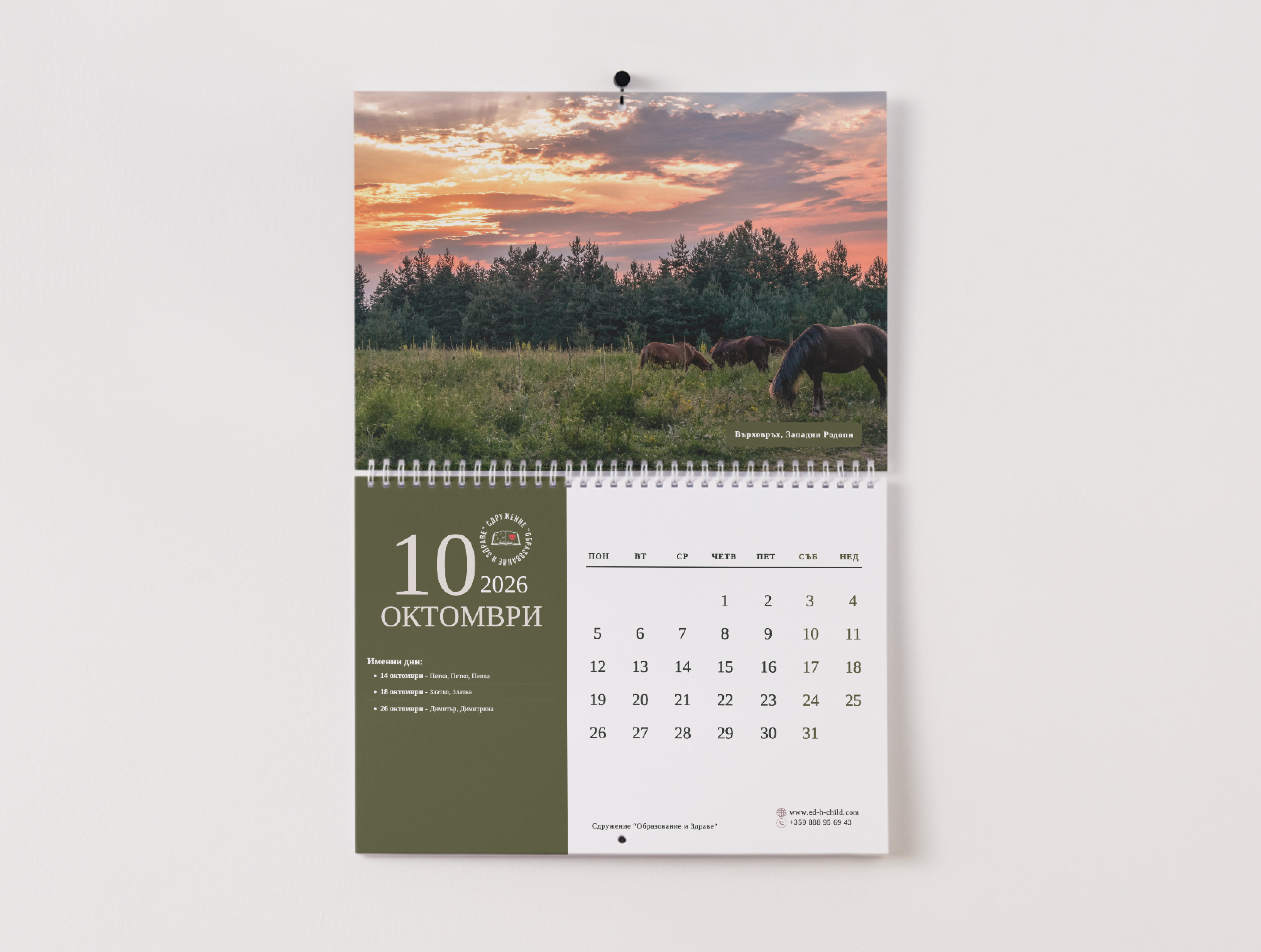
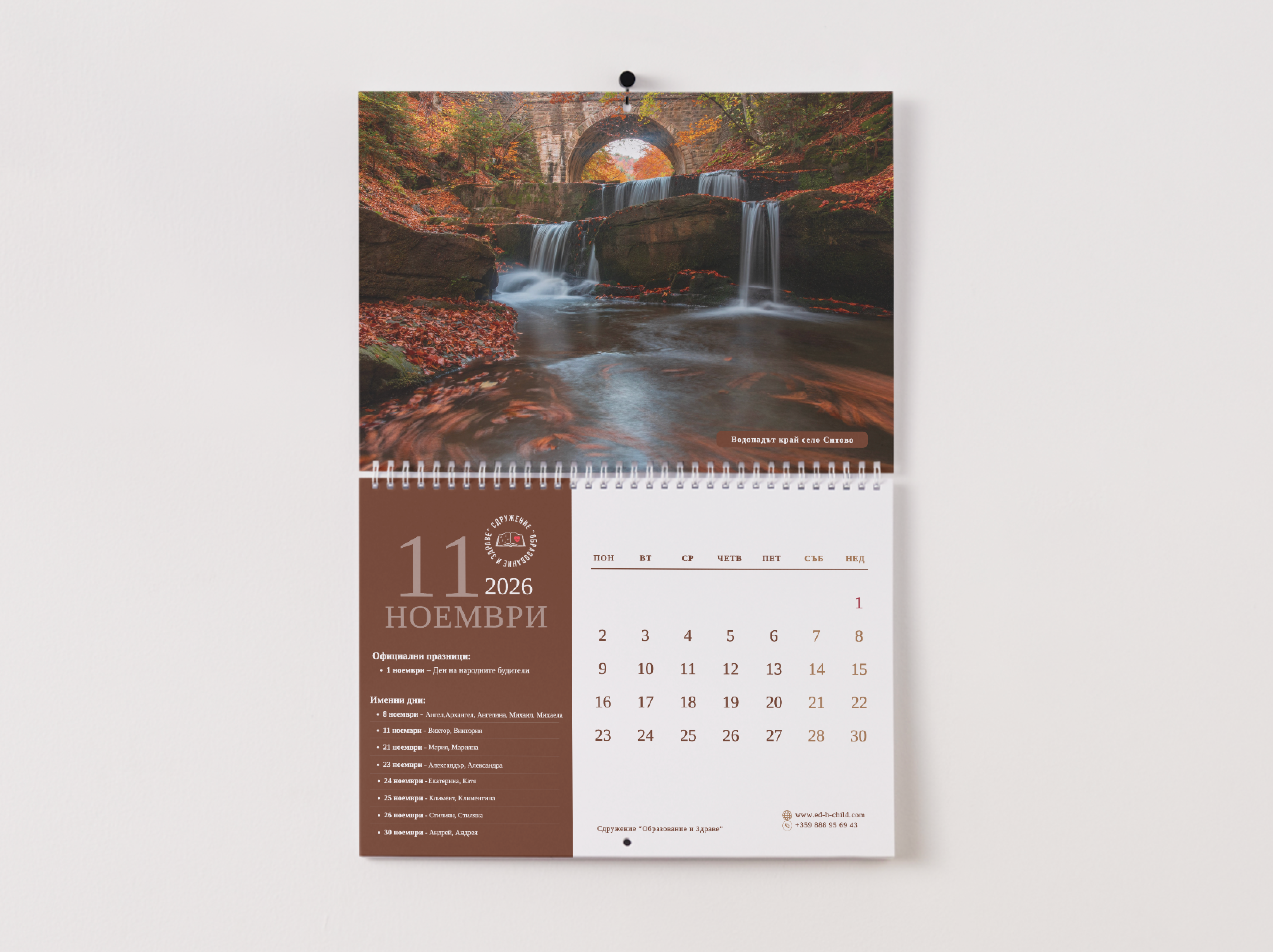
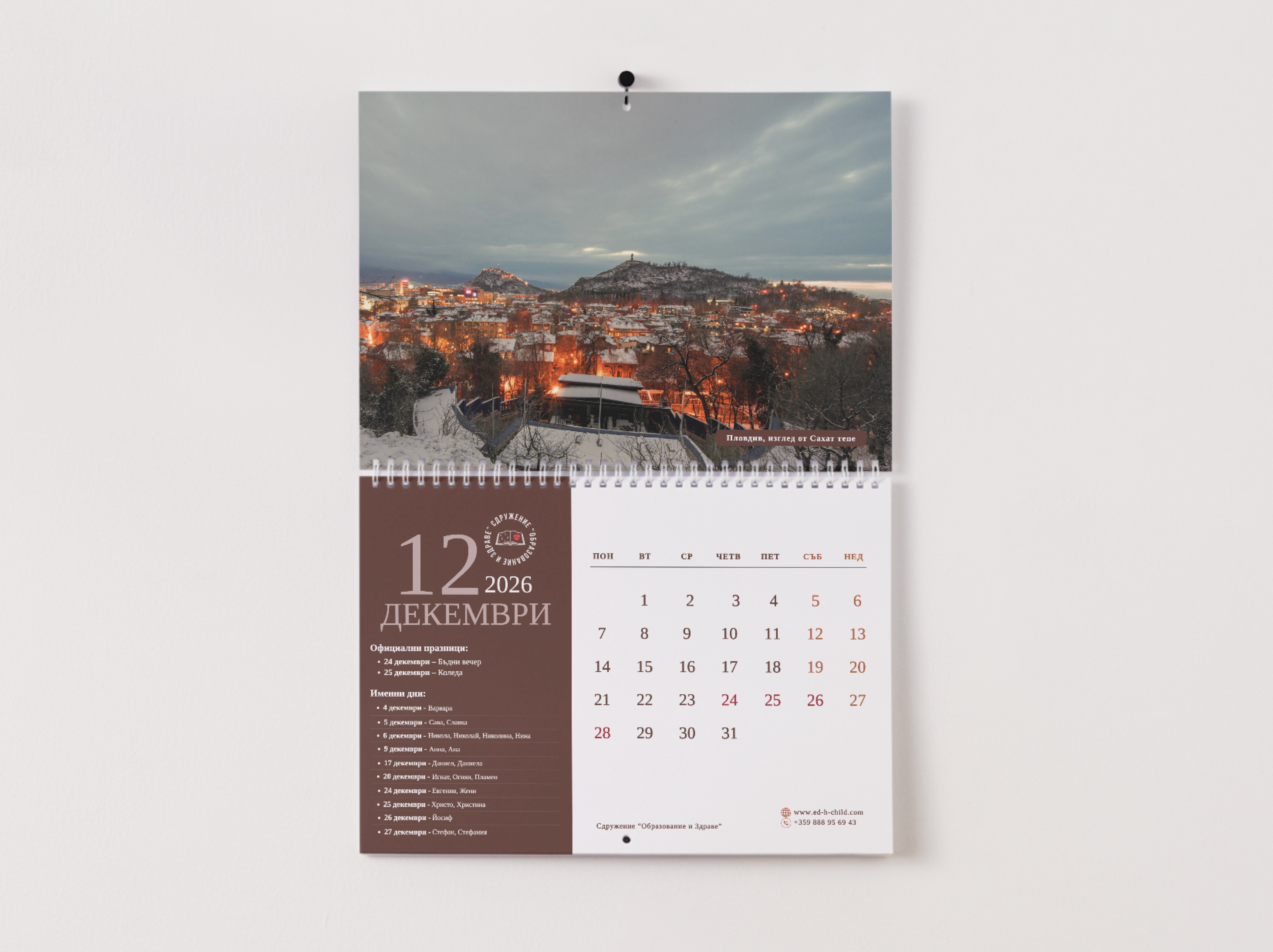
This calendar is more than a way to measure time - it’s a collection of real moments, captured with care, created to give hope.

Through the lens of a local photographer, we tell quiet, human stories from within a place where strength is found in the smallest things. Every purchase becomes a contribution - supporting the education of children in the local hospital, helping them continue to learn, dream, and look beyond their current reality.

Non-profit Association "Education and Health" - Gallery

Process & Approach

We didn’t begin with design.
We began with listening.

Understanding the mission of the organization meant stepping into a world where health and education meet - where children face challenges most never have to, yet continue to carry curiosity, resilience, and light.

Instead of creating something polished and distant, we chose to stay close to reality. The photography captures honest, unfiltered moments - glances, gestures, stillness - each frame holding a quiet story.

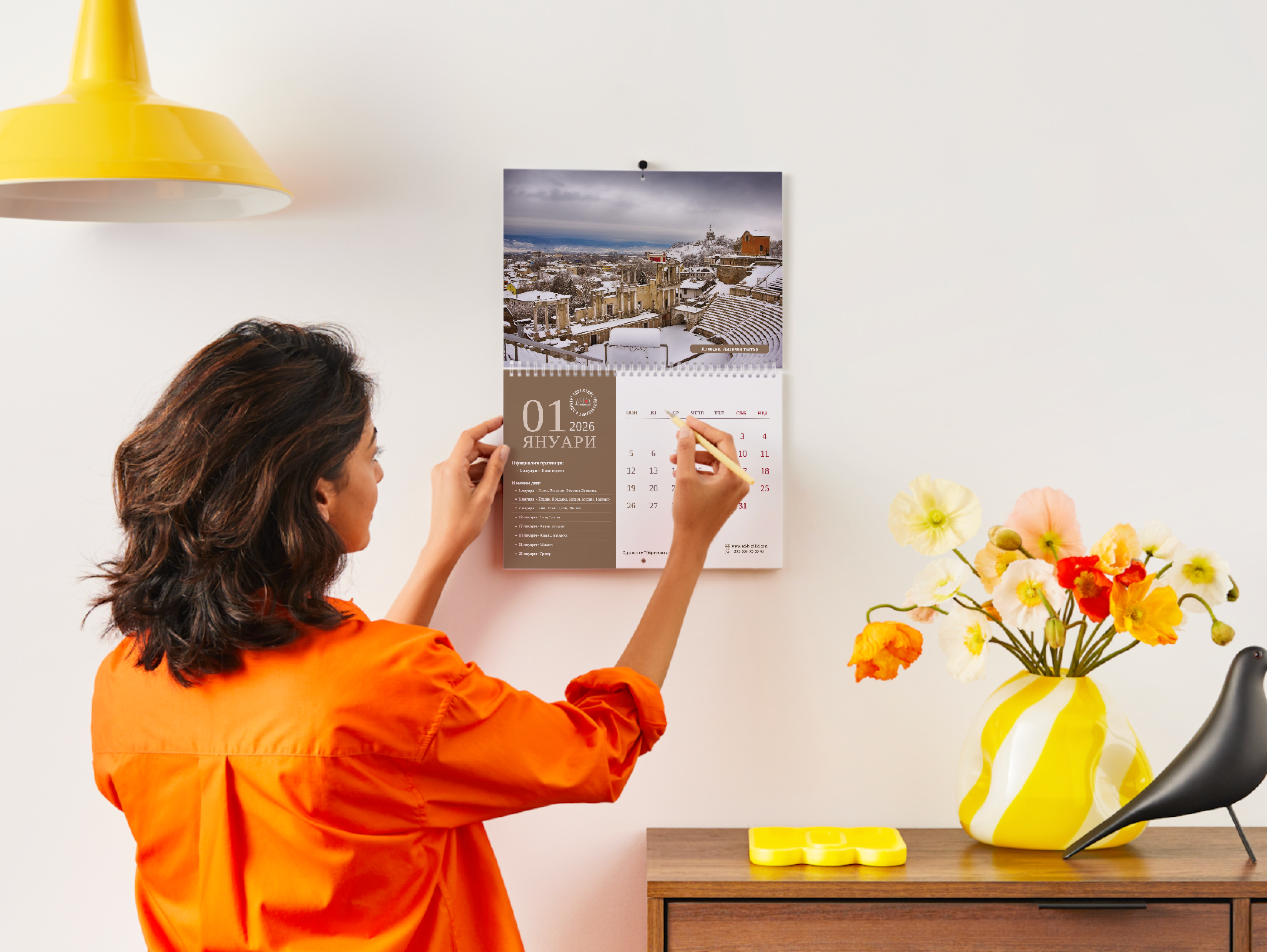
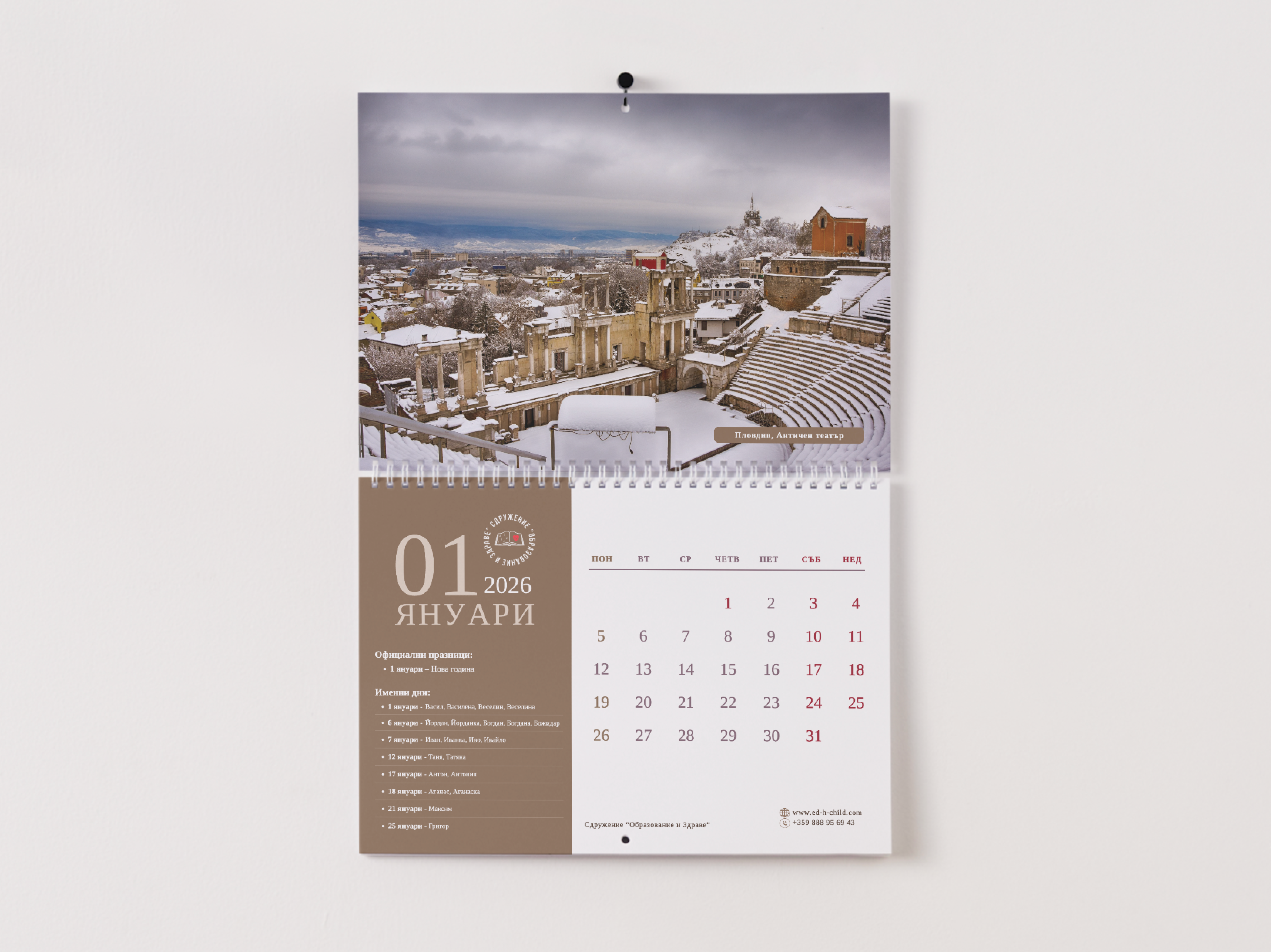
The design was intentionally restrained. Soft, minimal, and respectful. Nothing competes with the emotion of the images. Each month unfolds like a chapter - inviting the viewer not just to look, but to feel.

This calendar isn’t meant to impress.
It’s meant to connect.

Understanding the mission of the organization and defining the key message: supporting children’s education within a healthcare environment.

Establishing the creative direction—human-centered, warm, and honest. Deciding to rely on real photography to build trust and emotional engagement.

Working with a local photographer to curate and select images that reflect care, resilience, and hope.

Developing a consistent layout, typography, and spacing system to ensure harmony across all months.

Designing each calendar page to balance imagery and functionality (dates, readability, usability).

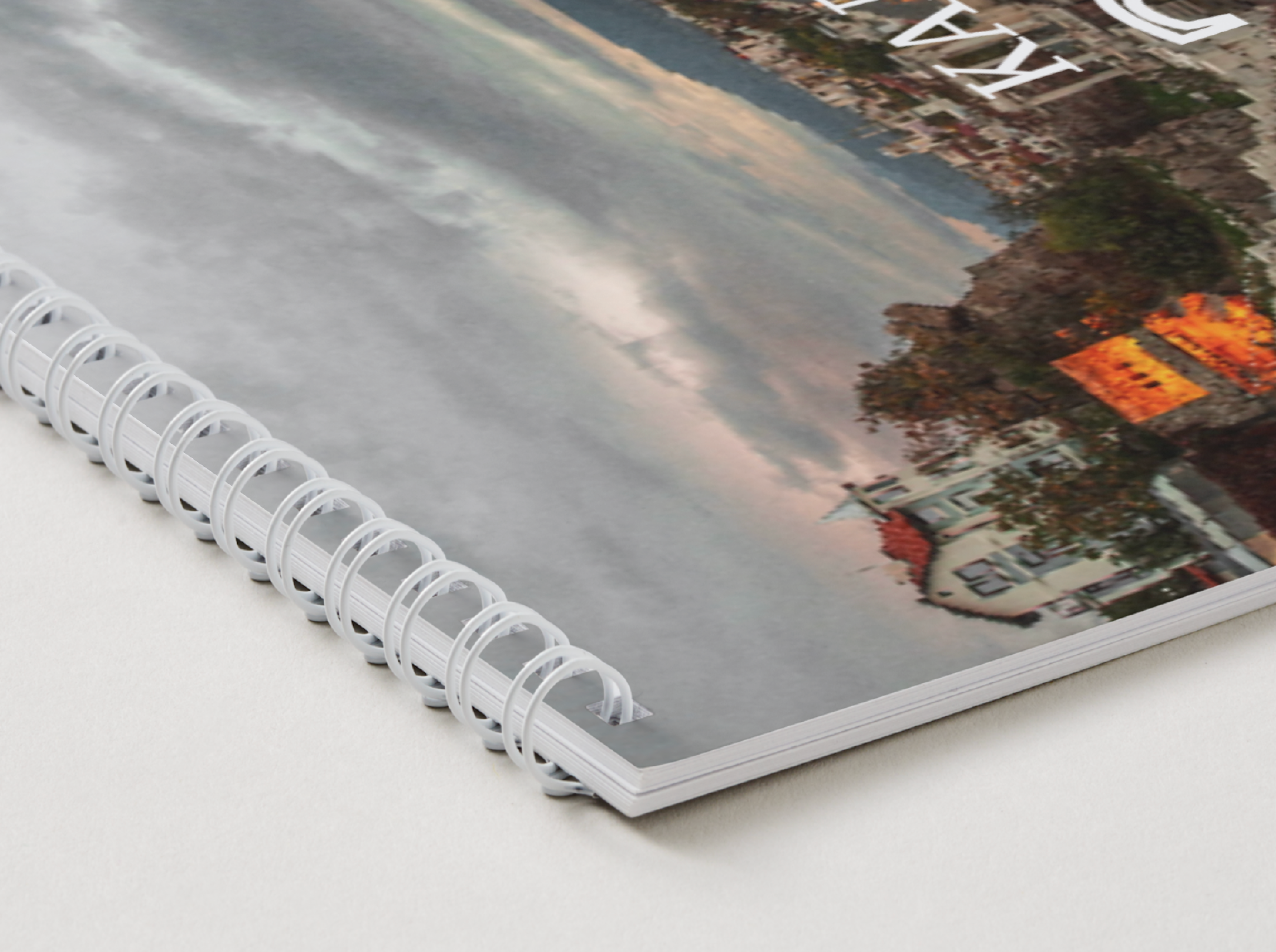
Finalizing files for print, ensuring color accuracy, paper selection, and overall quality meet the intended emotional and visual standard.