
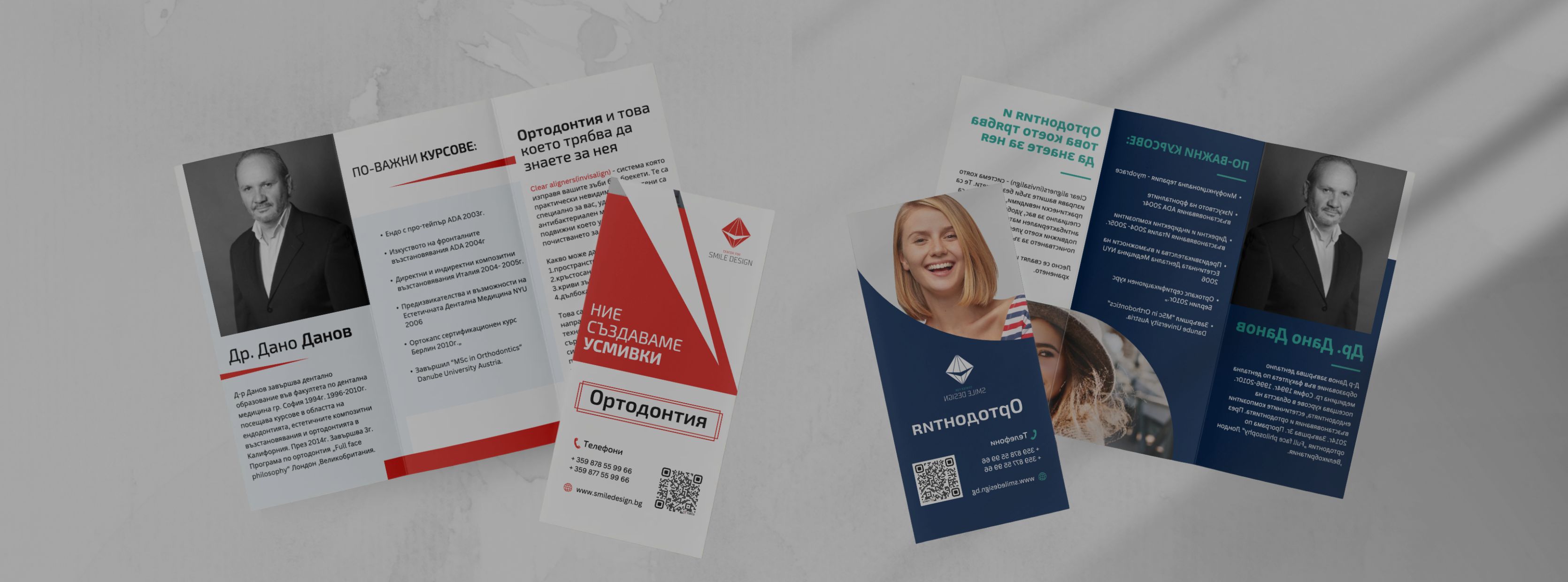
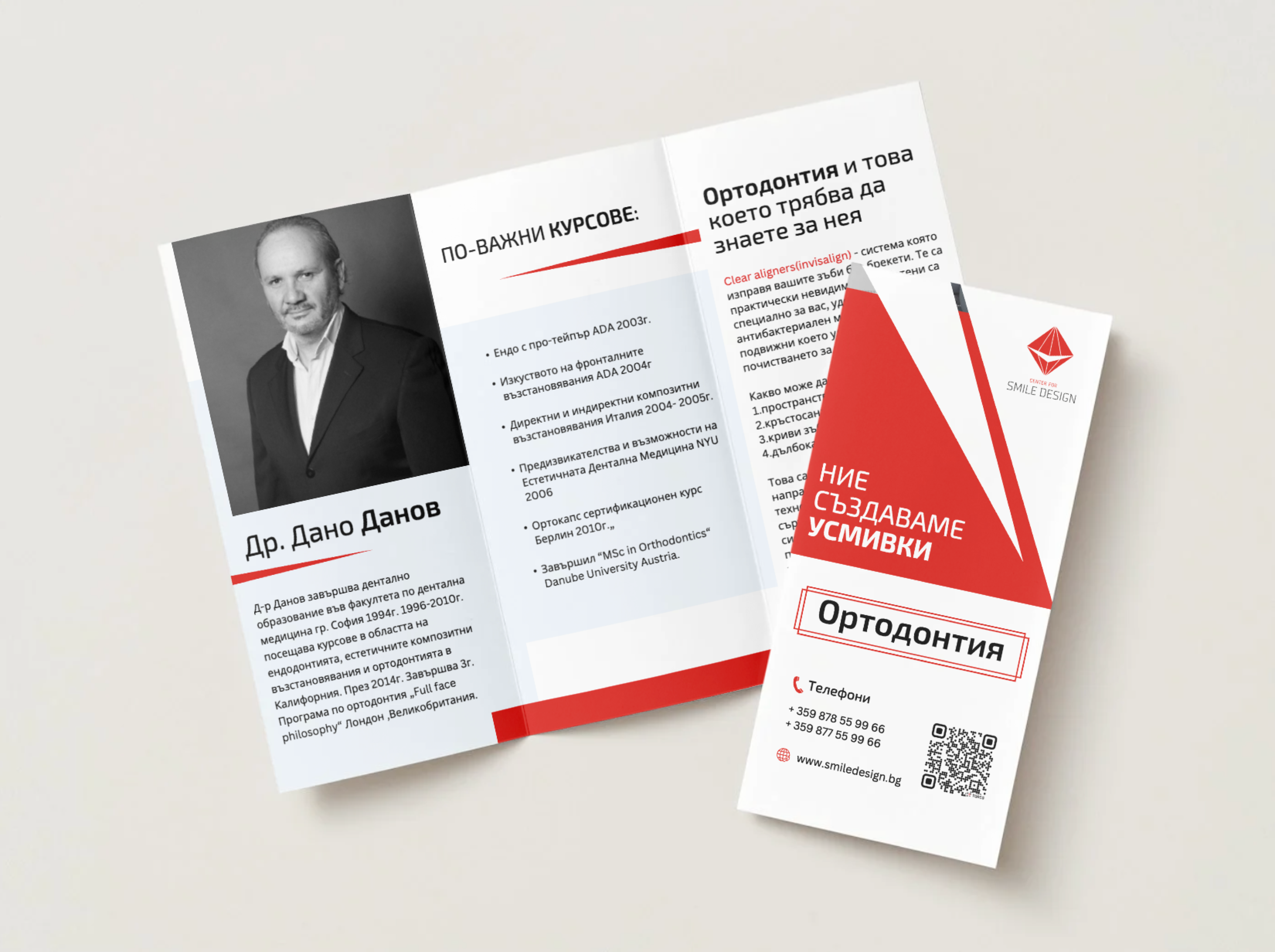
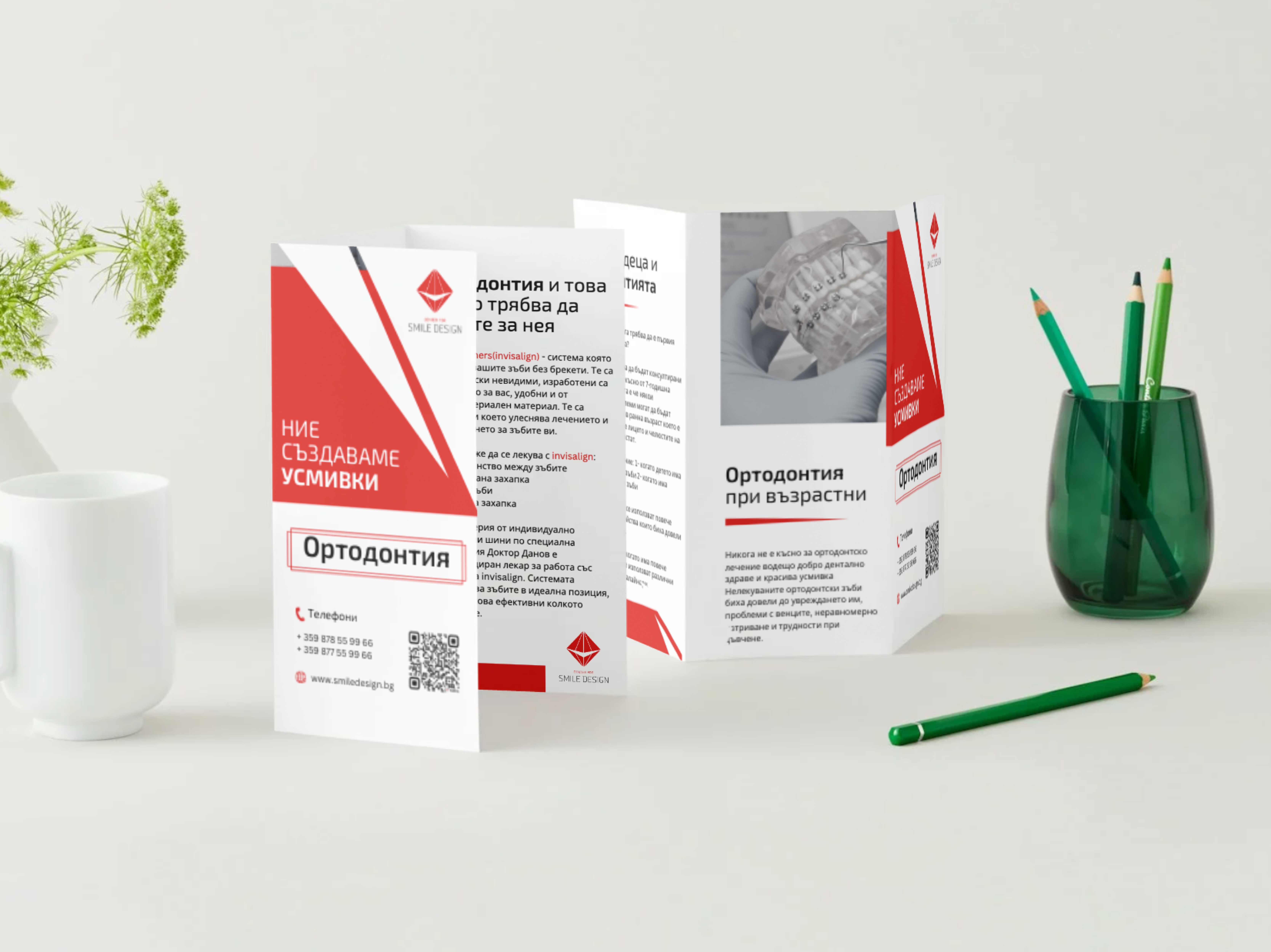
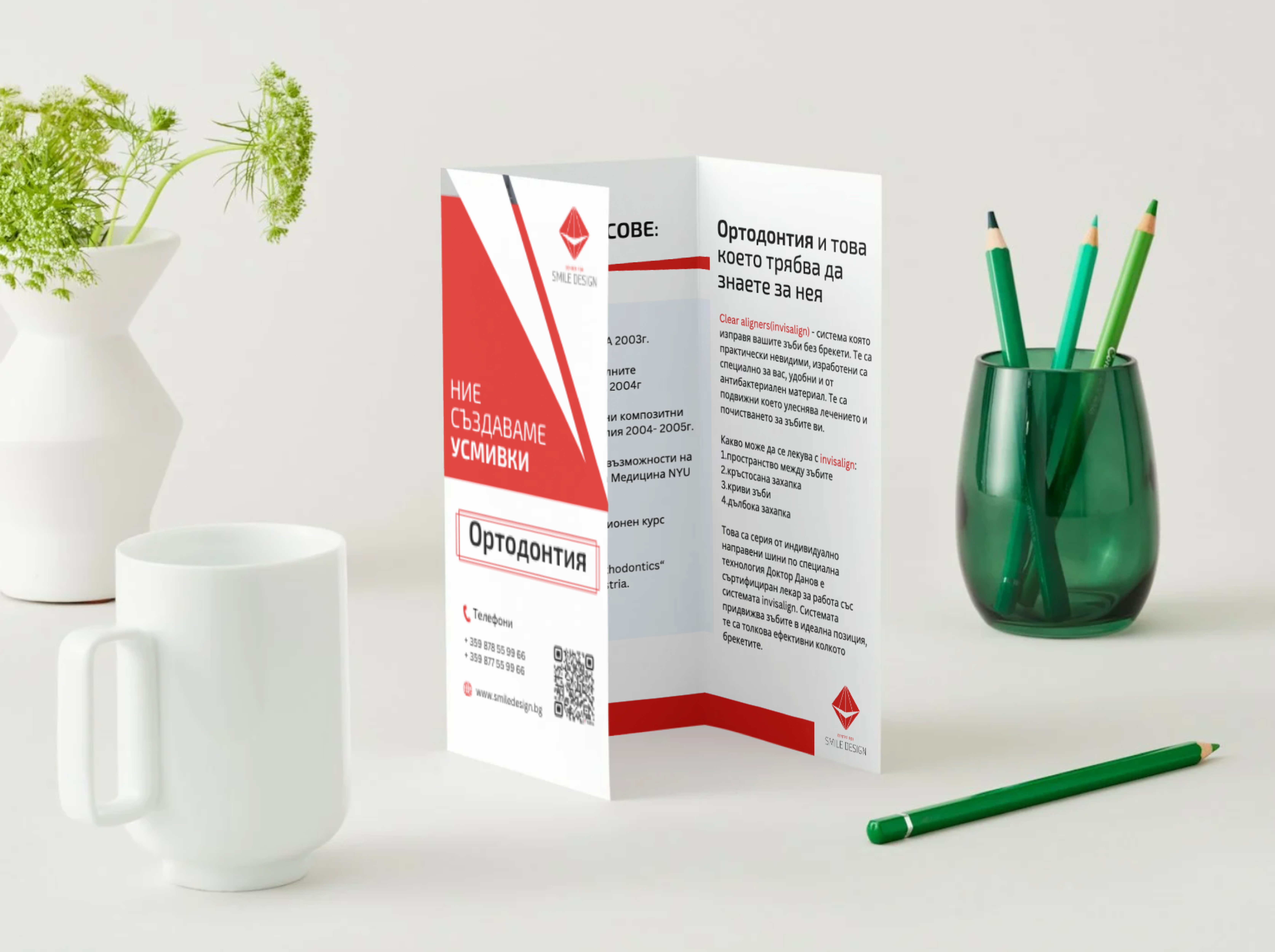
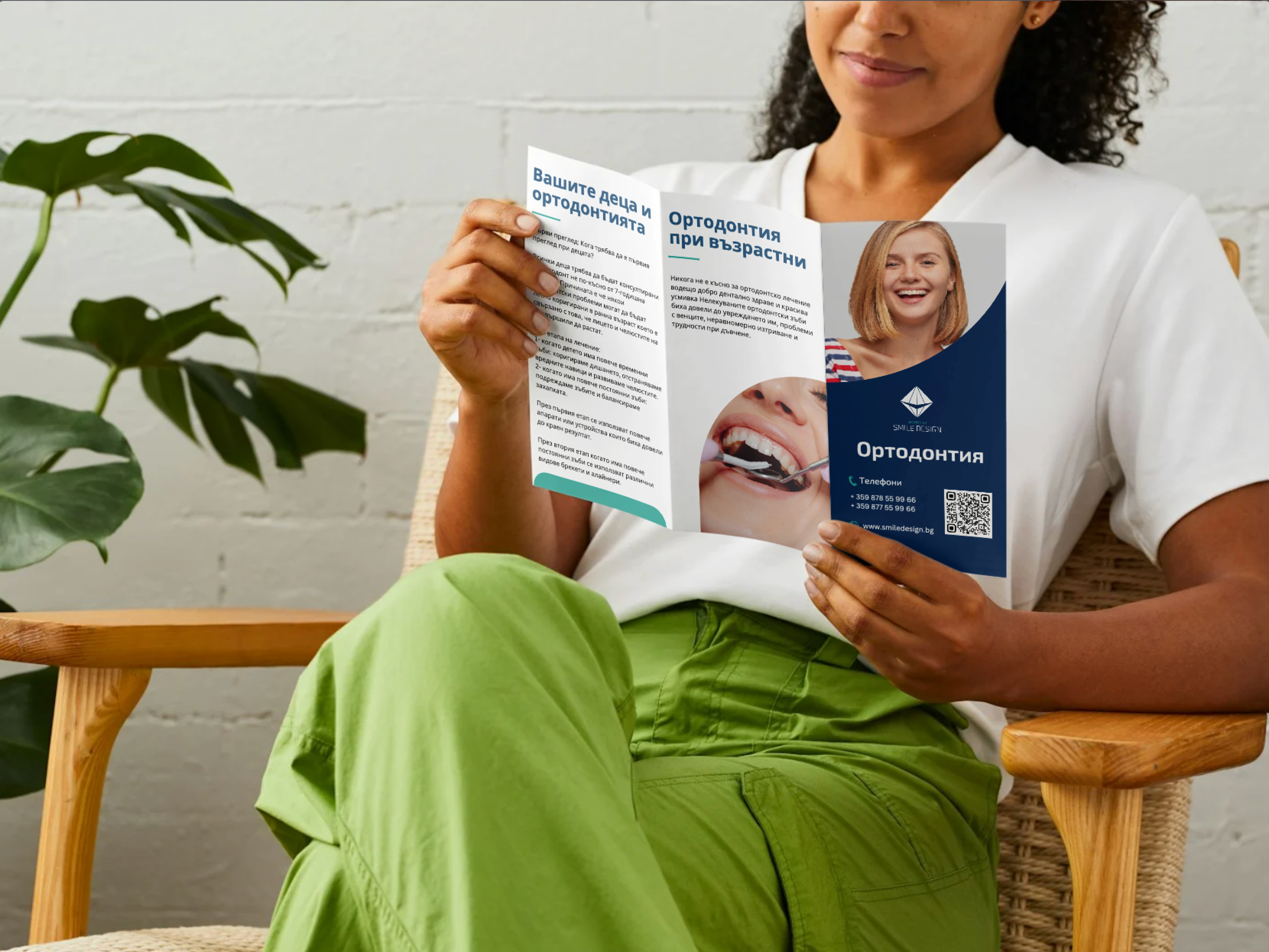
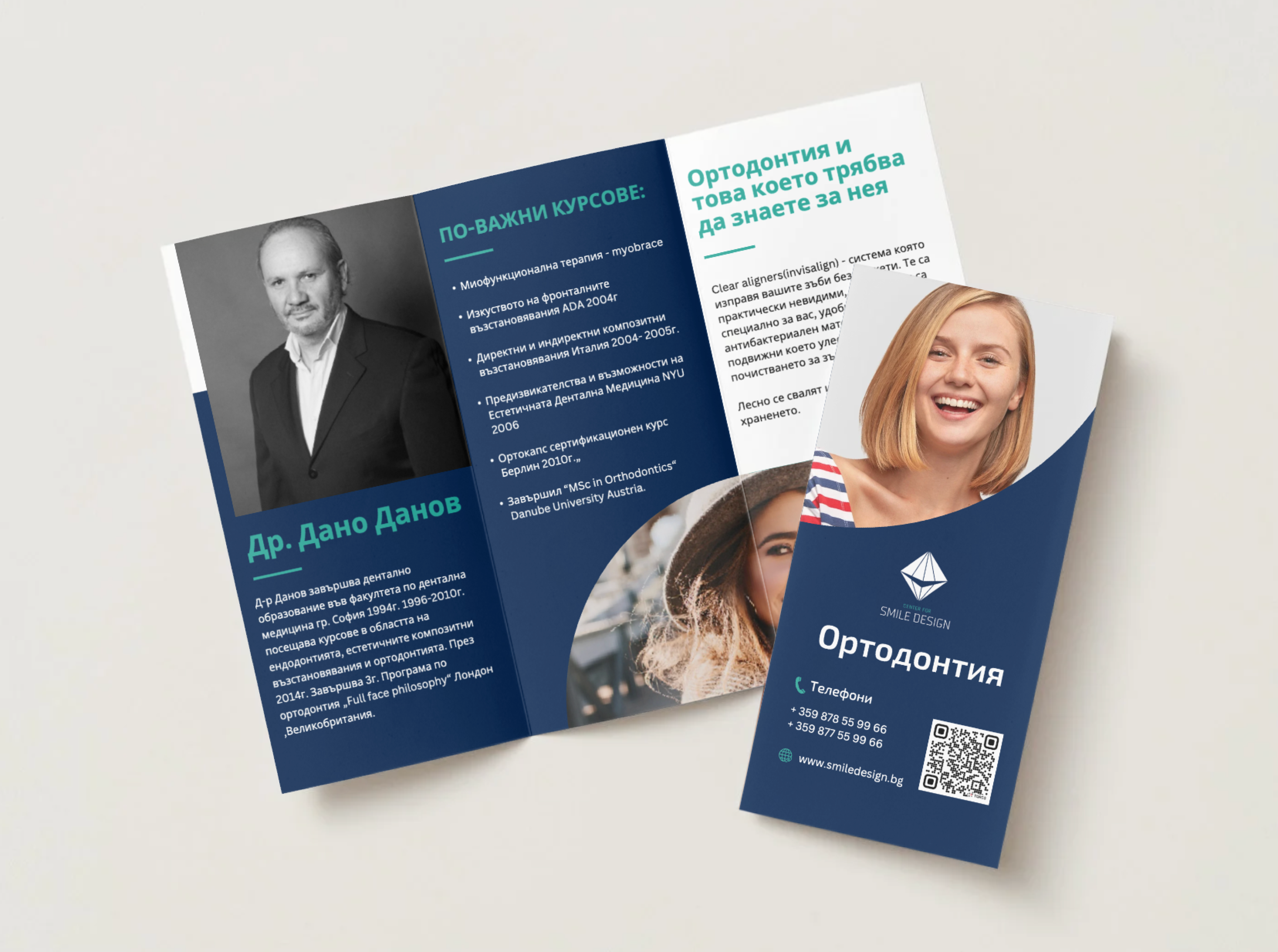
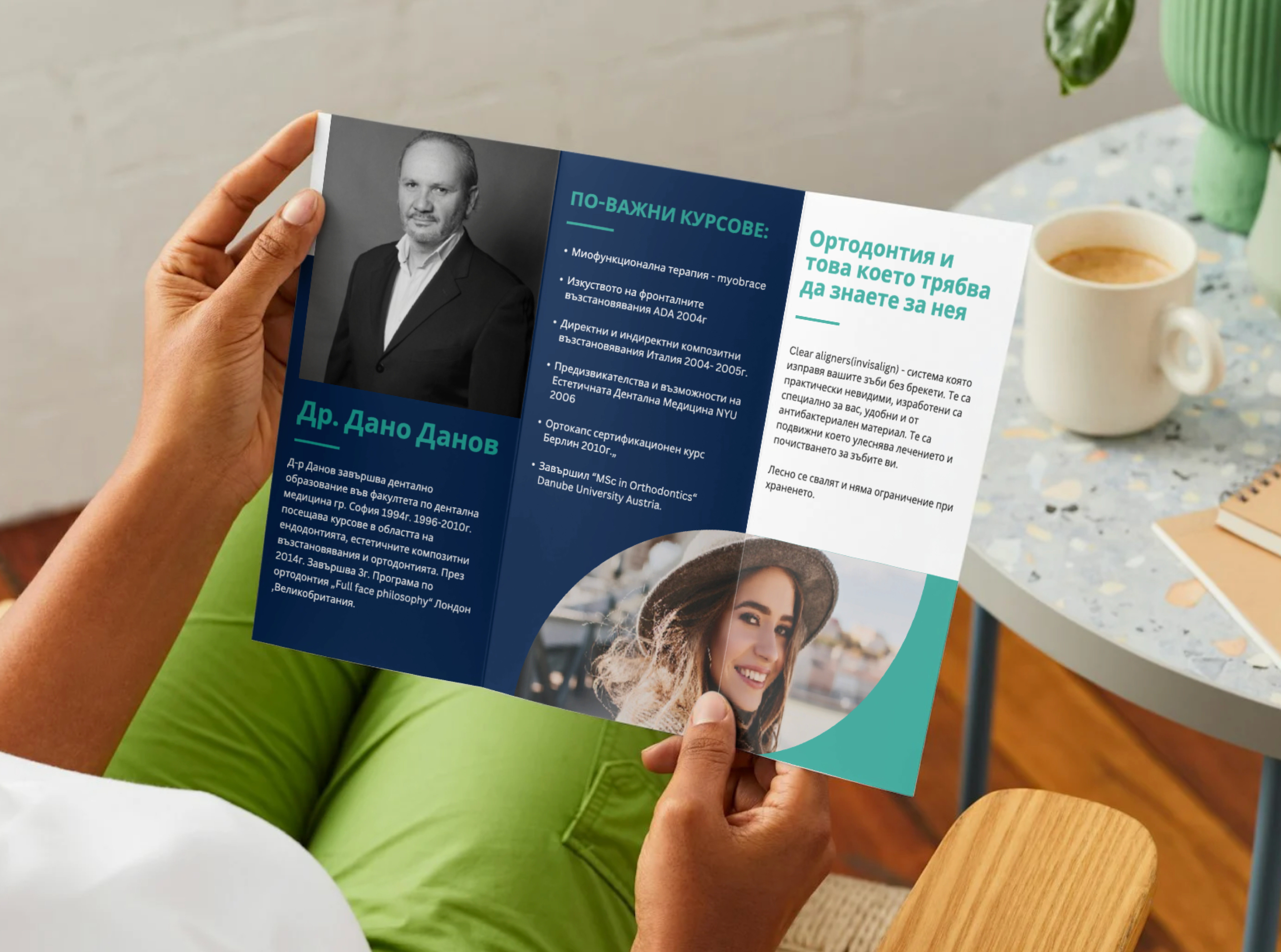
The project focused on creating a clear and engaging tri-fold brochure that presents key services while maintaining a strong visual identity.
A clean grid system was developed to ensure smooth content flow and intuitive reading, guiding the viewer from introduction to services and contact details.
Two visual directions were explored: one aligned with the existing red and white brand identity, and another using a blue and green palette inspired by the medical field.
Both versions share the same structure and hierarchy, ensuring consistency and clarity, with all design decisions optimized for a polished print result.