
Dual-Concept Tri-Fold Flyer
for a modern dental brand

Category
Brand Architecture
Client
Center of Smile Design
Start Date
2026
Center of Smile Design

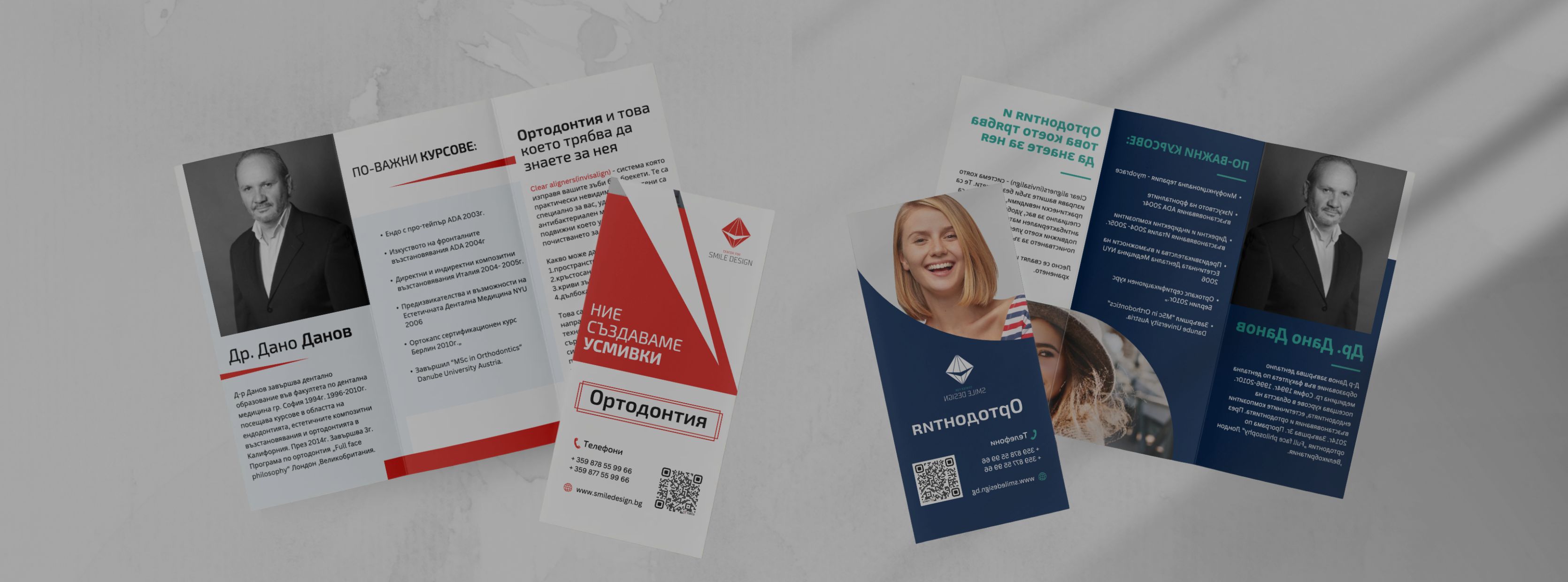
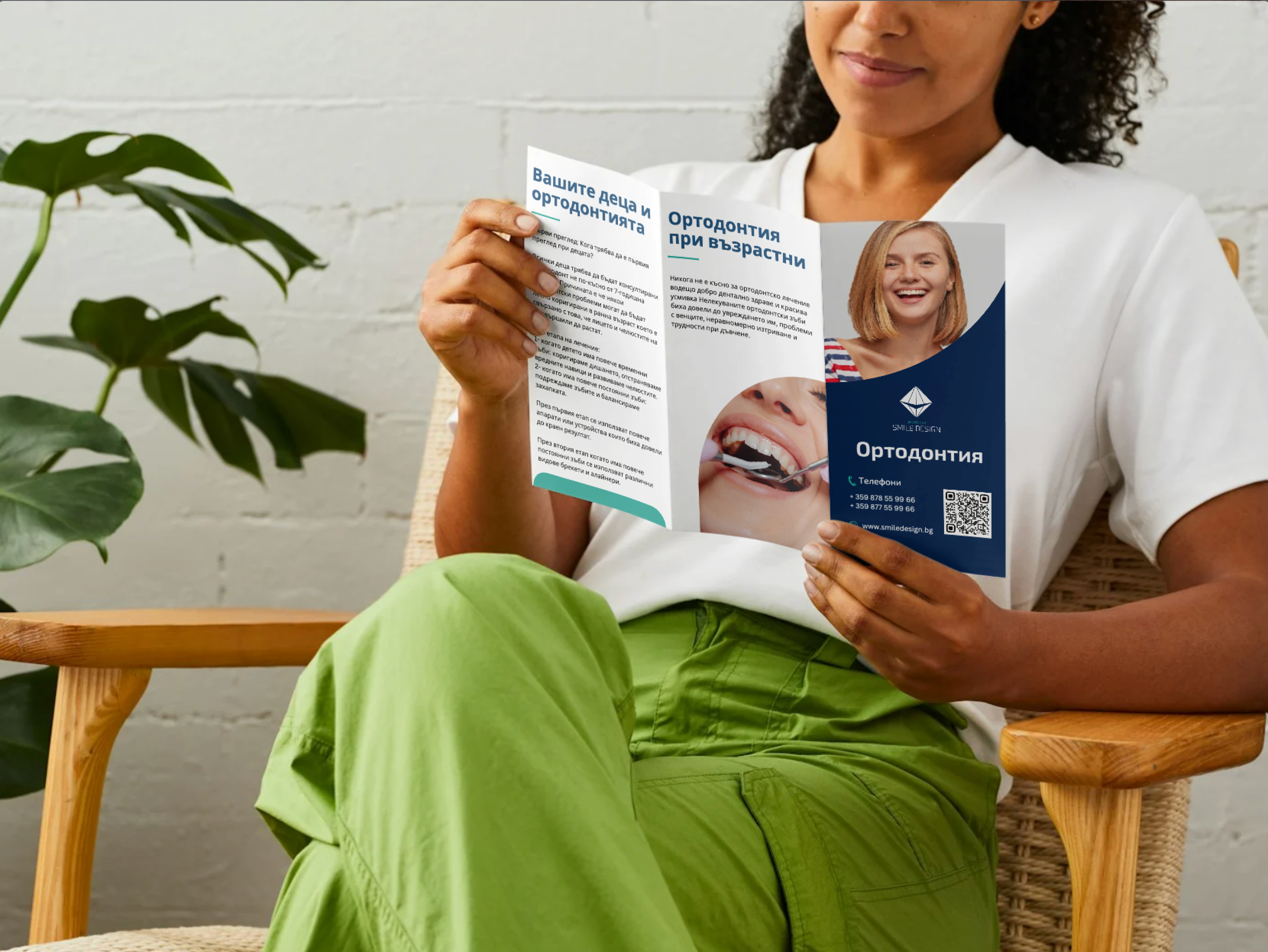
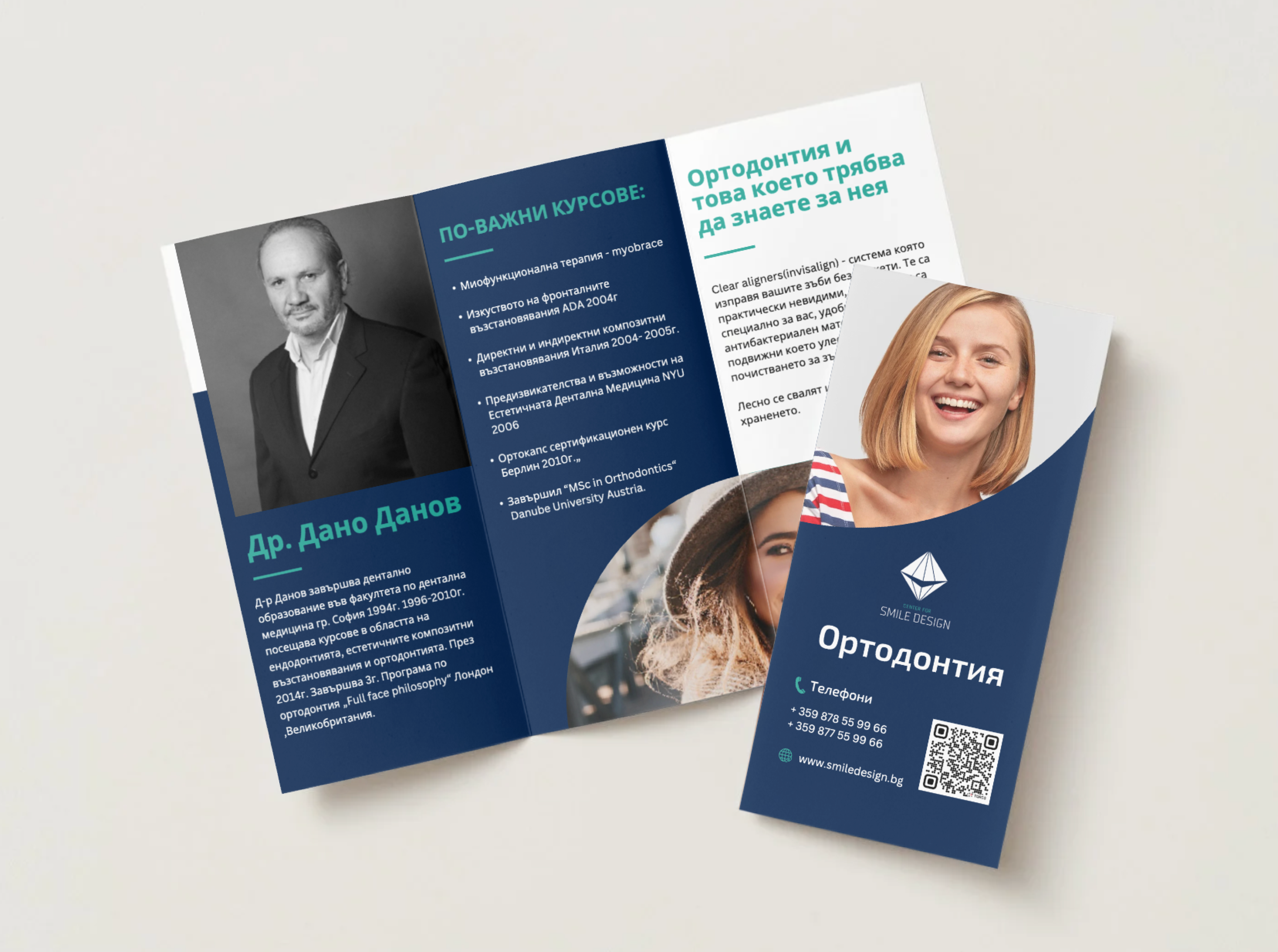
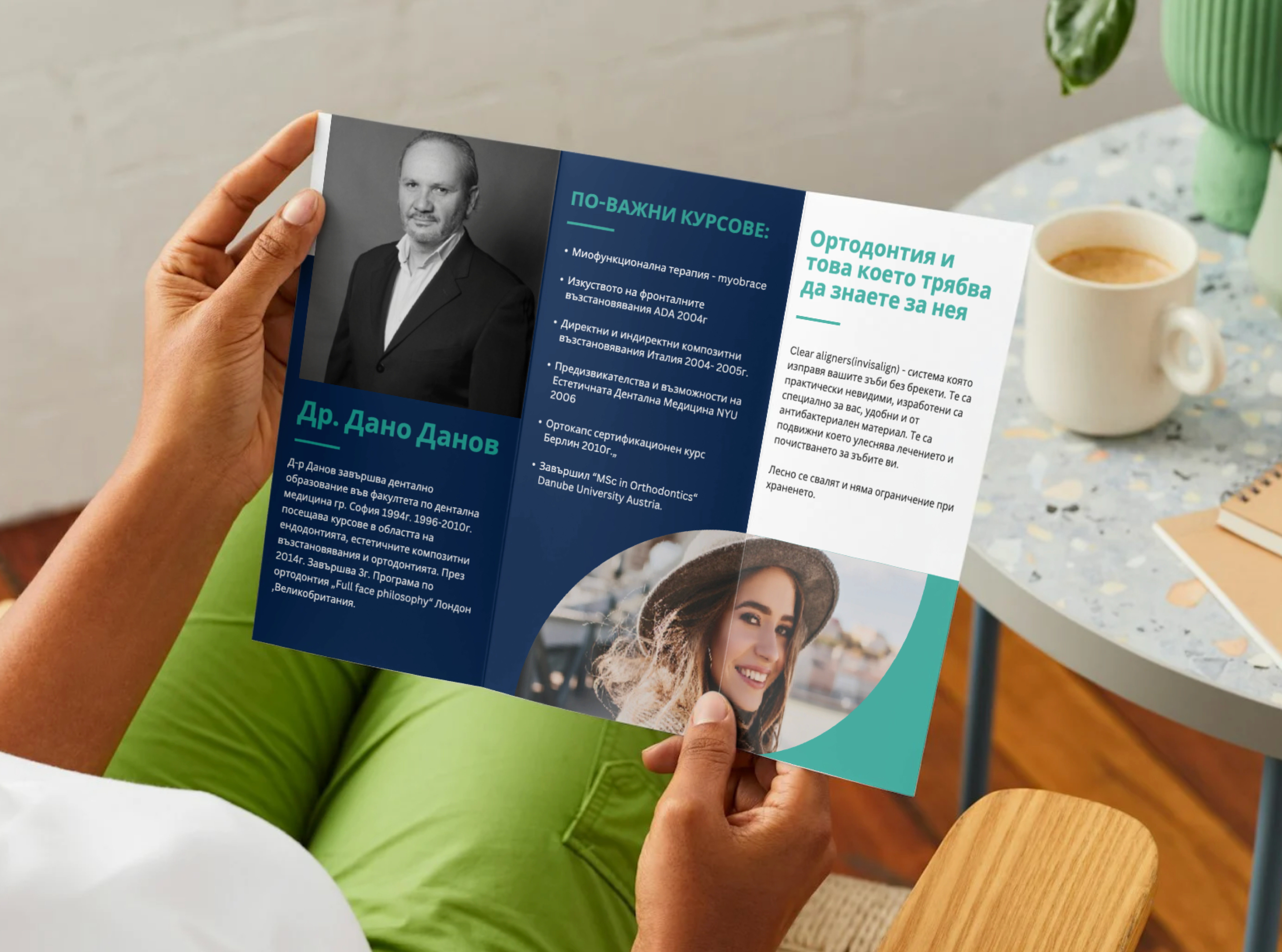
A tri-fold flyer designed for Center of Smile Design, combining clear communication with a refined visual approach. Two distinct directions were developed to explore both brand consistency and a more unconventional, industry-aligned aesthetic.

Center of Smile Design - Gallery

Process & Approach

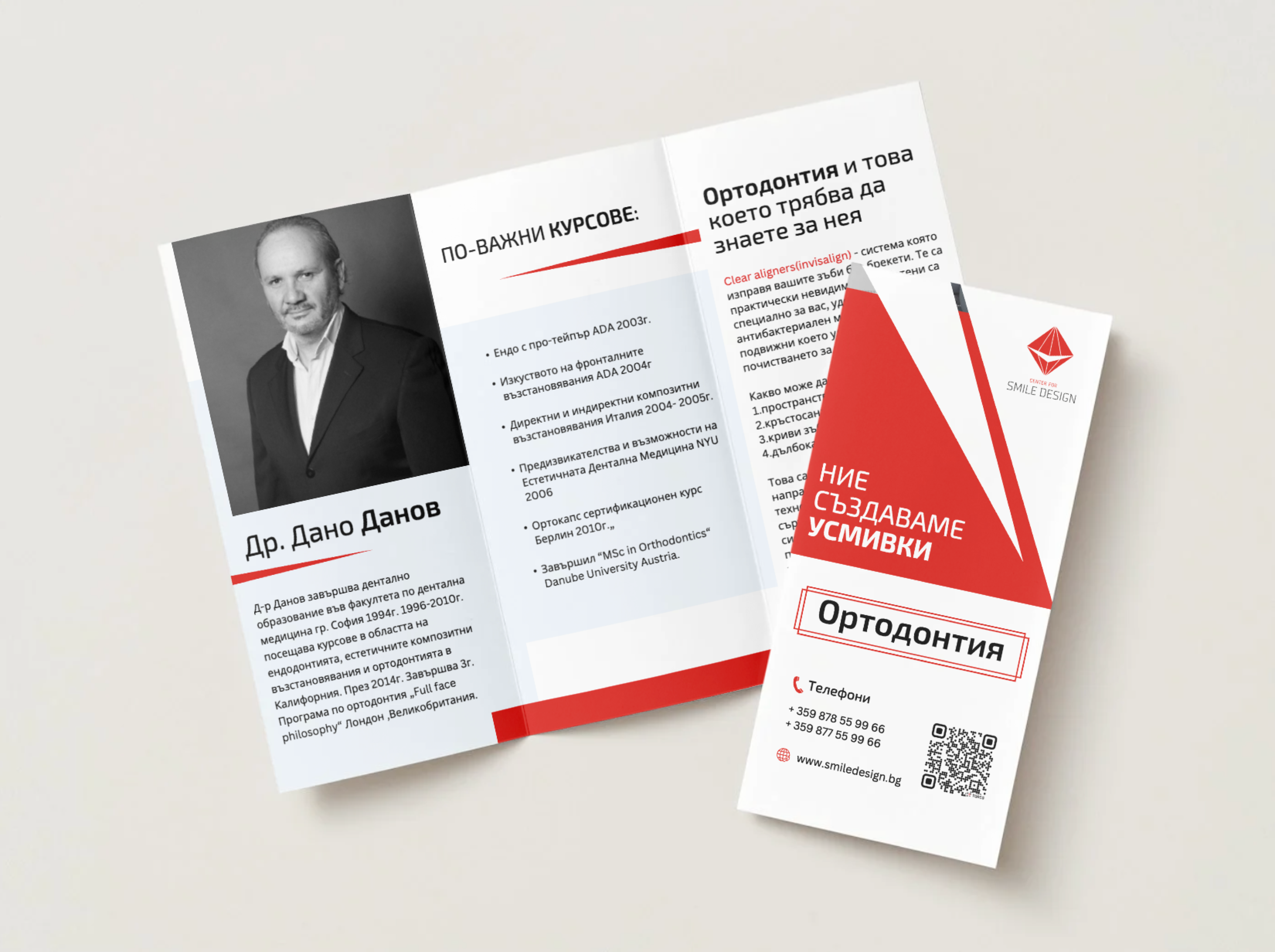
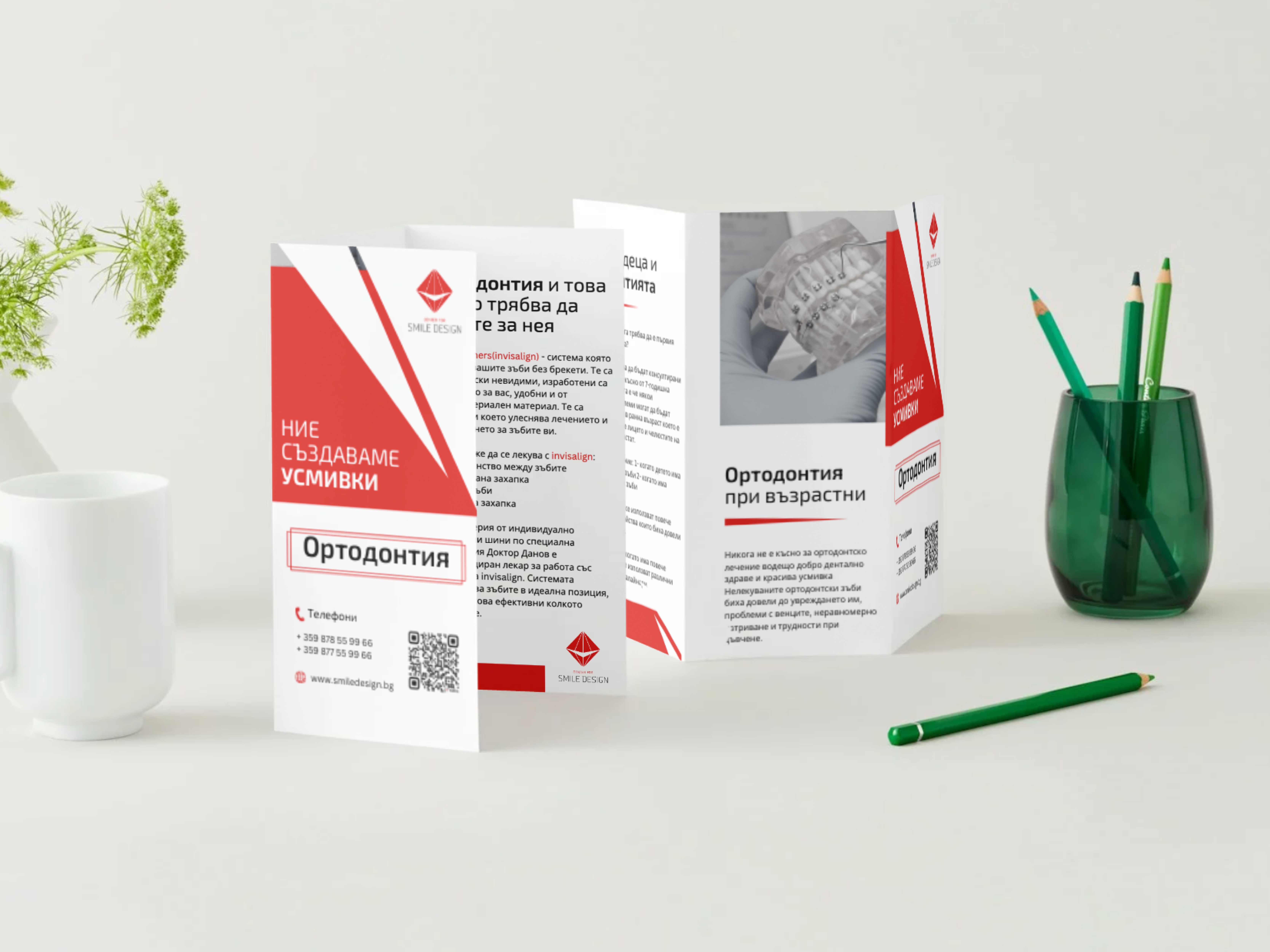
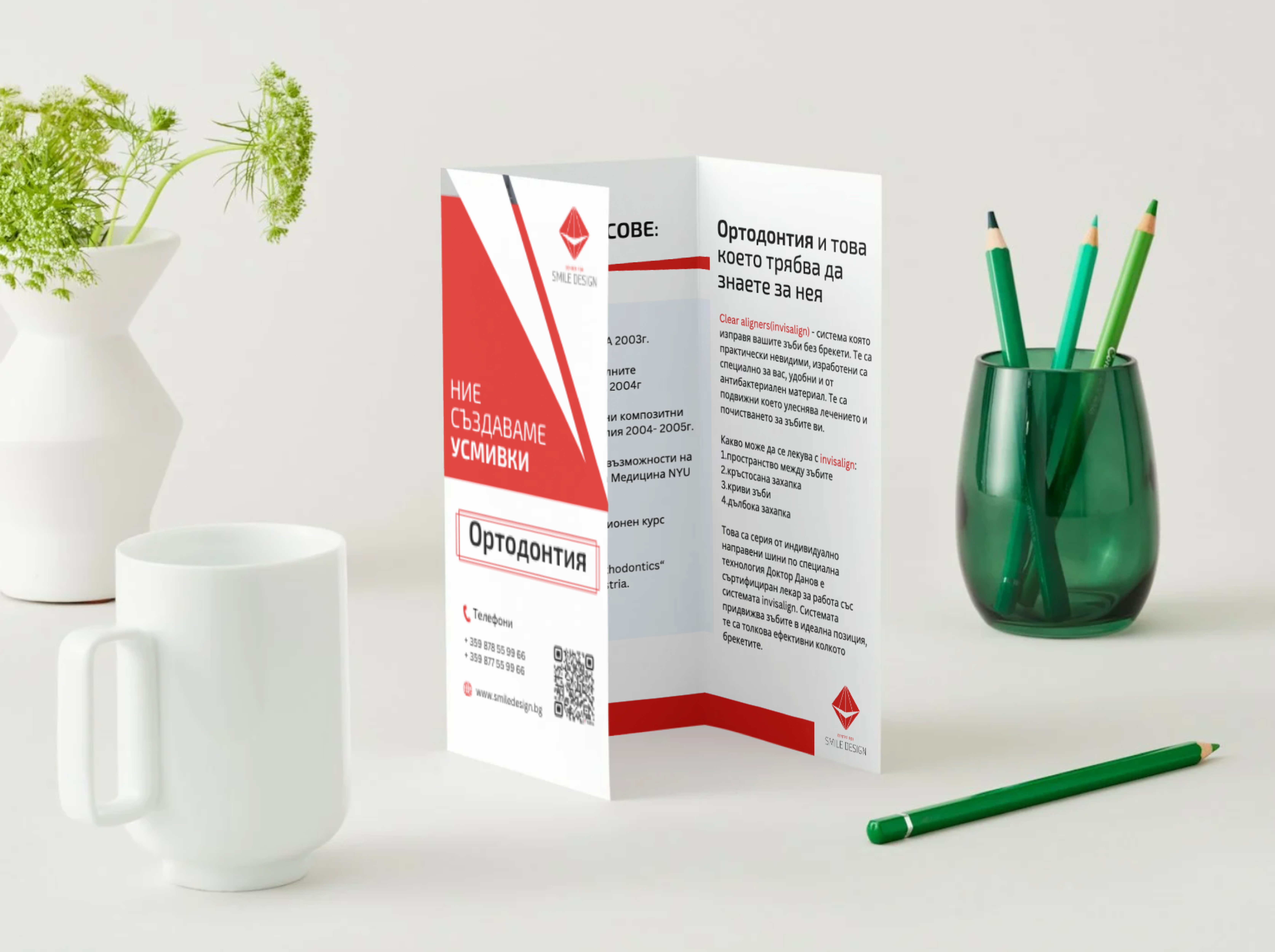
The project focused on creating a clear and engaging tri-fold brochure that presents key services while maintaining a strong visual identity.

A clean grid system was developed to ensure smooth content flow and intuitive reading, guiding the viewer from introduction to services and contact details.

Two visual directions were explored: one aligned with the existing red and white brand identity, and another using a blue and green palette inspired by the medical field.

Both versions share the same structure and hierarchy, ensuring consistency and clarity, with all design decisions optimized for a polished print result.


We analyzed the clinic’s services with a focus on orthodontic care for both adults and children, structuring the content to address different patient needs clearly and effectively.

A tri-fold layout was developed to guide the reader through the brochure - from a general overview to detailed orthodontic services, with the inner section dedicated to presenting one of the clinic’s dentists in a more personal and informative way.

Two visual directions were explored: one aligned with the existing red & white brand identity, and another using blue & green tones inspired by medical industry standards - offering both familiarity and a fresh alternative.

We refined typography, spacing, and visual hierarchy to ensure the content is easy to scan and engaging, balancing informative sections with a clean, approachable aesthetic.

The final design was prepared with print in mind, ensuring accurate fold alignment, consistent margins, and a seamless reading experience across all panels.